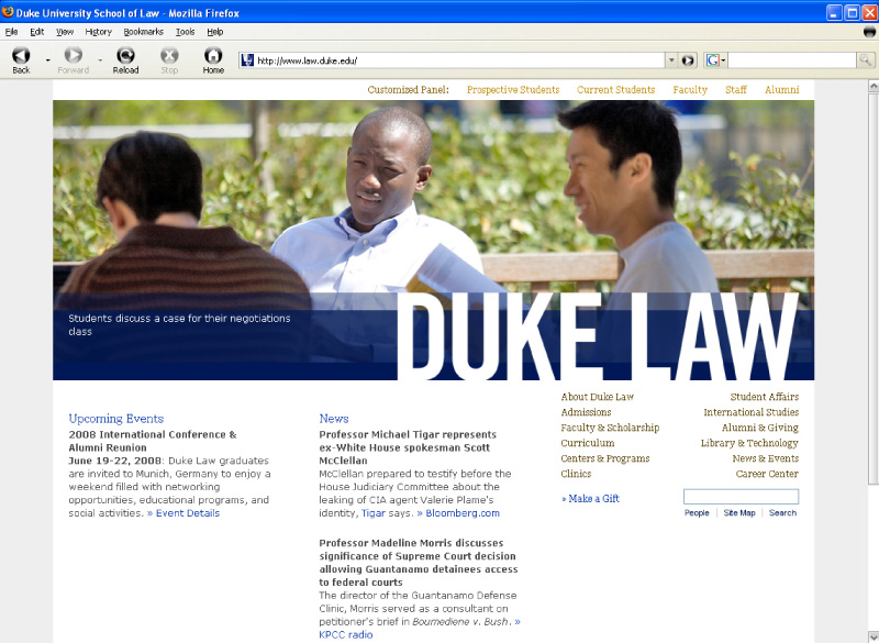
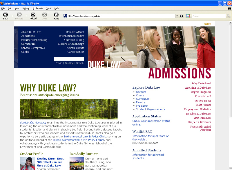
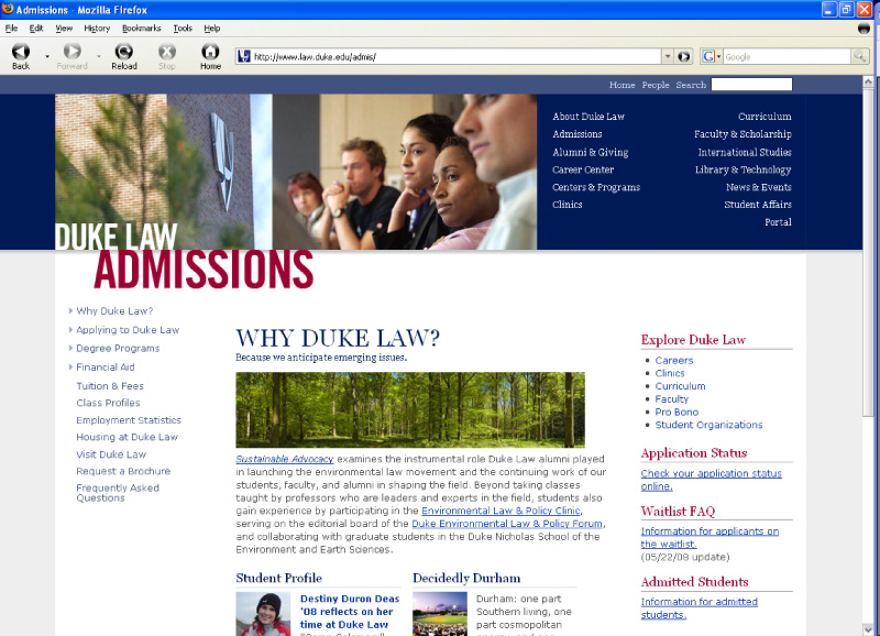
Spearheaded a project to tweak a recently released website redesign. The navigation was unclear and problematic for two core audiences: the current students and staff. In addition, the homepage did not have adequate space to highlight programs and departments buried in second and third level pages.
Before:
After:
Before:
After:


